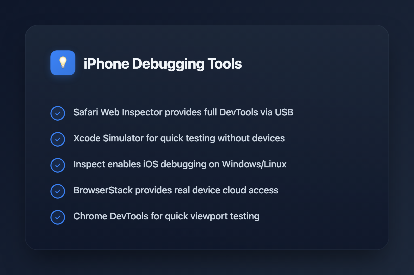
7 Essential Tools for Debugging Responsive Websites on iPhone in 2026


Testing responsive websites on actual iPhones reveals bugs that desktop emulators miss. Safari's rendering engine, touch interactions, and viewport behavior differ enough from Chrome that you need real iOS debugging in your workflow. Here are the tools that make it possible.
1. Safari Web Inspector (Mac + iPhone)
Best for: Native debugging with full DevTools when you have a Mac
Apple's built-in solution remains the most powerful option if you're in the Apple ecosystem. Connect your iPhone via USB, and you get the same inspector experience as desktop Safari—Elements, Console, Network, and Timelines tabs included.
Setup:
- On iPhone: Settings → Safari → Advanced → Enable Web Inspector
- On Mac: Safari → Settings → Advanced → "Show Develop menu in menu bar"
- Connect iPhone via USB cable
- In Safari's Develop menu, select your iPhone and the active tab
What you can do:
- Inspect and modify DOM elements in real-time
- Debug JavaScript with breakpoints
- Monitor network requests and timing
- View console logs from the device
- Profile rendering performance
Limitation: Requires a Mac. Windows and Linux developers need alternatives.
2. Xcode iOS Simulator
Best for: Quick testing without a physical device
The iOS Simulator bundled with Xcode provides a free way to test Safari on various iPhone models. While it doesn't perfectly replicate hardware performance, it catches most responsive layout issues.
Setup:
- Install Xcode from the Mac App Store
- Open Simulator (in /Applications/Xcode.app/Contents/Developer/Applications/)
- Select device model from File → Open Simulator
- Use Safari's Develop menu to inspect the simulated Safari
Pro tip: Test both portrait and landscape orientations—many responsive bugs only appear during rotation.
Limitation: Mac-only, and simulated Safari may behave slightly differently than real devices for touch events and performance.
3. Inspect (Cross-Platform)
Best for: Windows and Linux developers who need real iOS debugging
Inspect is the solution for developers without Macs. It provides Safari DevTools-equivalent functionality on Windows, macOS, and Linux, connecting to real iOS devices or simulators.
Features:
- Full element inspection and CSS editing
- JavaScript debugging with Console access
- Network request monitoring
- WebView debugging inside iOS apps
- USB and Wi-Fi connection options (Wi-Fi on macOS only)
Requirements: iOS 11 or later, USB cable for Windows/Linux
This tool eliminates the Mac requirement that has historically made iOS debugging painful for cross-platform teams.
4. Polypane
Best for: Viewing multiple iPhone viewports simultaneously
Polypane is a Chromium-based browser built specifically for responsive development. Instead of resizing one window repeatedly, you see your site rendered at multiple breakpoints side-by-side—all synchronized.
Key features:
- Device presets: Pre-configured iPhone dimensions including safe area insets
- Synchronized interaction: Scroll, click, or type in one pane, and all viewports update together
- Small viewport units: Accurate
svhemulation that matches iOS Safari's dynamic viewport behavior - Accessibility overlay: Built-in contrast checking and focus order visualization
Pricing: Starts at $9/month
Limitation: Uses Chromium rendering, not WebKit. Catches layout issues but won't surface Safari-specific JavaScript bugs.
5. Sizzy
Best for: iOS and Android side-by-side comparison
Sizzy takes the multi-viewport approach with a focus on mobile development. It displays your site across iPhone and Android devices simultaneously, with each viewport fully interactive.
Features:
- Multiple synced device views in one window
- Built-in DevTools for each viewport
- Screenshot capture across all devices at once
- Live CSS editing
Pricing: $15/month or $499 one-time purchase
Useful when you need to ensure parity between iOS and Android responsive behavior without switching between tools.
6. BrowserStack Live
Best for: Testing on real iPhones without owning them
BrowserStack provides cloud access to over 3,500 real devices, including every iPhone model running various iOS versions. You interact with actual hardware through your browser.
Features:
- Real Safari on real iPhones (not emulation)
- Full Safari Web Inspector access
- Network condition simulation (3G, 4G, 5G, offline)
- Local testing tunnel for development servers
- Up to 4 devices simultaneously on higher plans
Why real devices matter: Simulators and emulators miss device-specific quirks—touch responsiveness, actual Safari rendering, hardware keyboard behavior, and performance characteristics only appear on real hardware.
Pricing: Free trial available, paid plans for regular use
7. Chrome DevTools Device Mode
Best for: Quick viewport testing during development
Chrome's built-in device mode isn't iOS debugging, but it's the fastest way to check responsive layouts at iPhone dimensions during active development.
Access: F12 → Toggle device toolbar (Ctrl/Cmd + Shift + M)
Features:
- iPhone device presets with correct dimensions
- Touch event simulation
- Network throttling
- Correct User Agent and Client Hints for selected device
Critical limitation: Chrome uses Blink, not WebKit. This catches sizing and layout issues but misses Safari-specific CSS bugs, JavaScript quirks, and rendering differences. Always verify on real Safari before shipping.
What to Actually Test
Once you have your tools set up, focus on these iOS-specific issues:
- Viewport units:
100vhbehaves differently on iOS Safari due to the dynamic address bar. Use100dvhor100svhfor predictable results. - Safe area insets: Notched iPhones need
env(safe-area-inset-*)for content that shouldn't hide under the notch or home indicator. - Position fixed: Fixed elements can behave unexpectedly during scroll, especially with the virtual keyboard open.
- Touch events: iOS has 300ms click delay on non-fast-tap elements. Use
touch-action: manipulationto eliminate it. - Orientation changes: Test both portrait and landscape. Many responsive bugs only appear after rotation.
- Safari privacy features: Cross-site tracking prevention and pop-up blocking may affect functionality that works fine in Chrome.
Recommended Workflow
- During development: Chrome DevTools device mode for quick iteration
- Before commits: Polypane or Sizzy to verify all breakpoints
- Before staging: iOS Simulator with Safari Web Inspector
- Before production: Real device testing via BrowserStack or physical iPhone
Each layer catches different issues. Chrome finds layout problems fast. Multi-viewport tools catch breakpoint edge cases. Real Safari reveals rendering and JavaScript quirks. Real devices expose performance and touch interaction issues.
Bottom Line
Safari holds roughly 14% of global browser market share, heavily concentrated on mobile. Shipping without iOS testing means shipping bugs to a significant portion of your users.
If you're on Mac: Safari Web Inspector with a real iPhone is unbeatable. If you're on Windows or Linux: Inspect gives you real iOS debugging without Apple hardware. For coverage across all breakpoints: Polypane or Sizzy. For comprehensive device testing without a device lab: BrowserStack.
The tools exist—the only question is whether you use them before your users find the bugs.